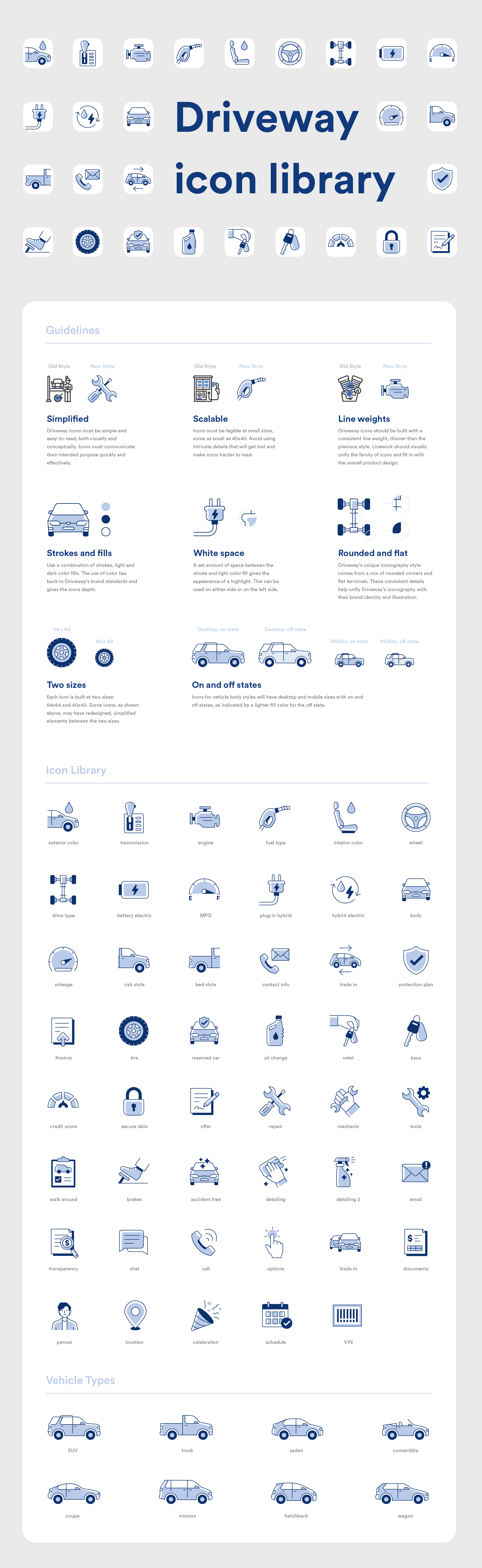
DRIVEWAY ICON LIBRARY
ICONOGRAPHY
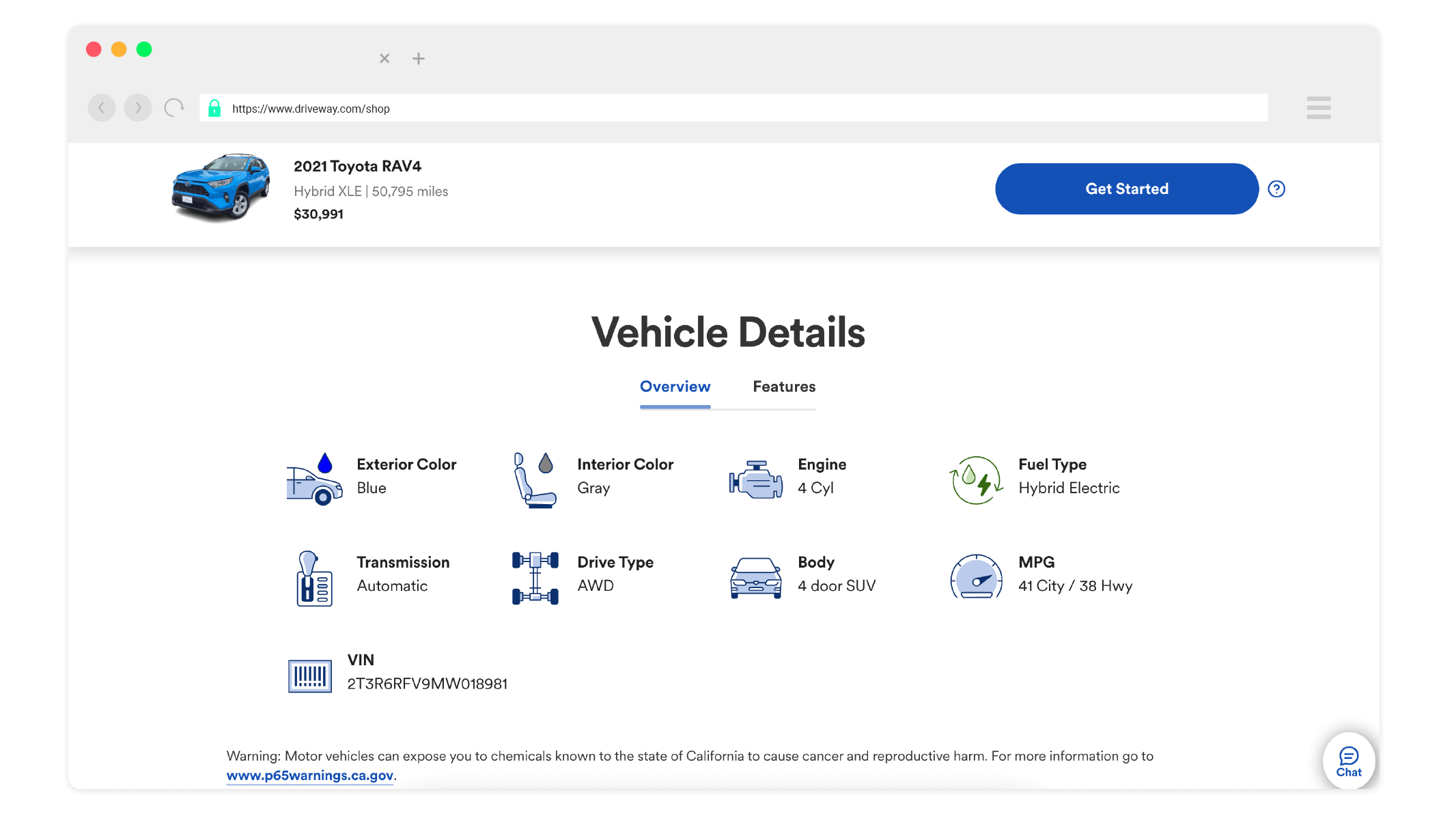
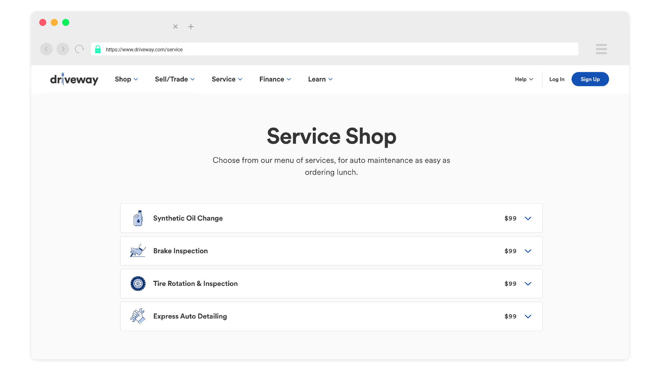
Driveway, an online platform to buy, sell or trade in cars, needed a redesign of their product iconography. The previous icon style was difficult to read and stylistically outdated; they needed a new style that communicated concepts effectively, fit in seamlessly with the overall product design, and felt like a family that could tie back to Driveway’s brand tone and visual language.
Working directly with a product designer, I was the sole illustrator on this project and was tasked with building out Driveway’s new icon library.
The first step was to develop a new visual style for the family of icons that improved upon the previous style. This phase involved trying out different styles and determining which fit in best with the brand.
Once a direction was chosen, I took to concepting out each icon featured in product and creating two sizes for each. This led to the creation of the icon library and the styleguide featured here.
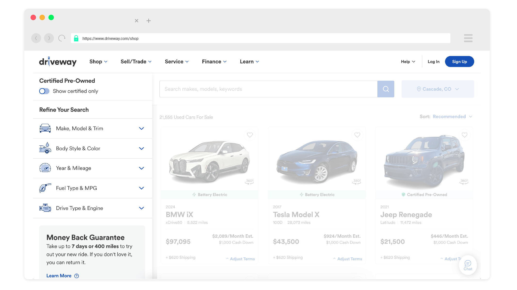
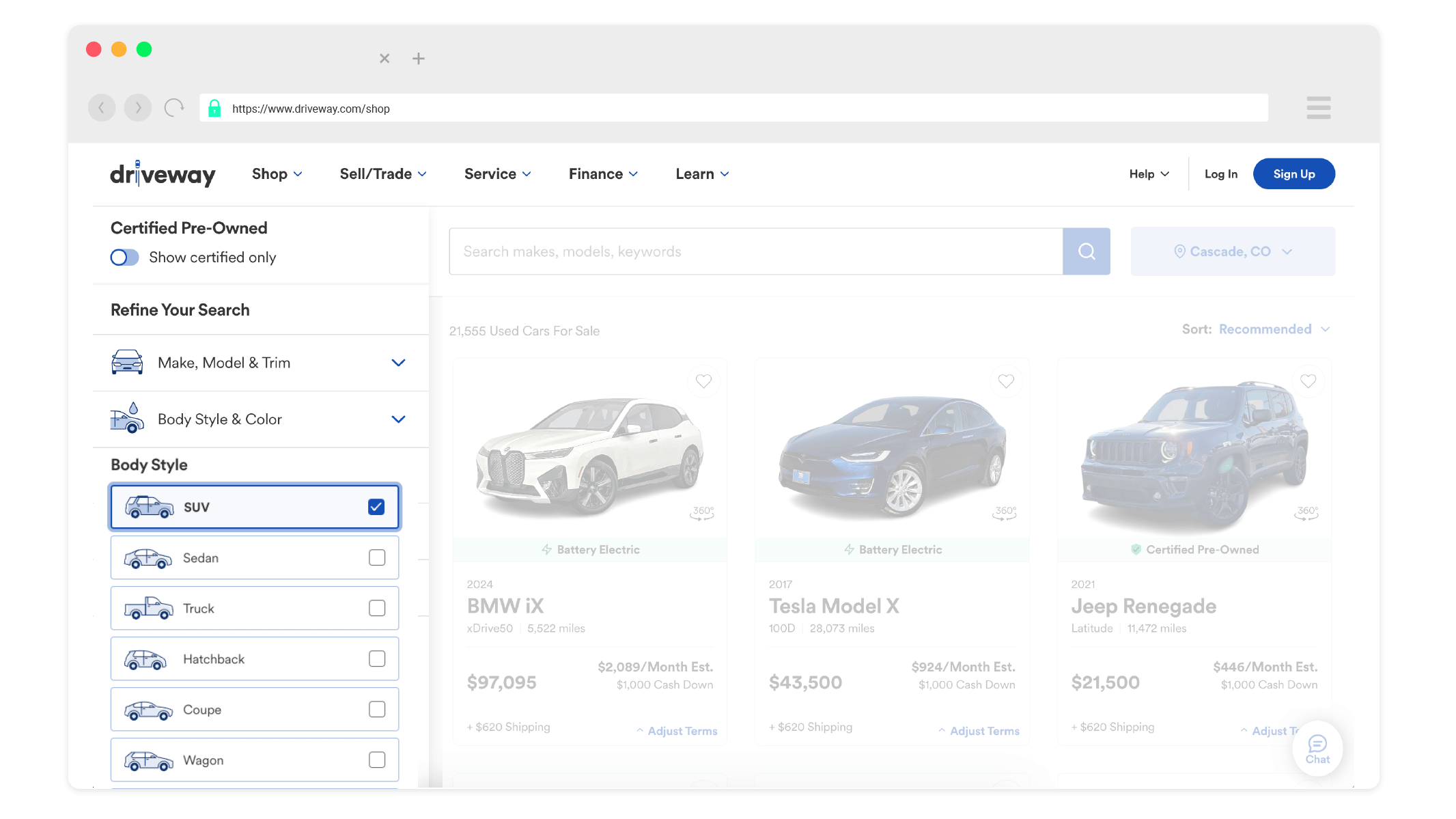
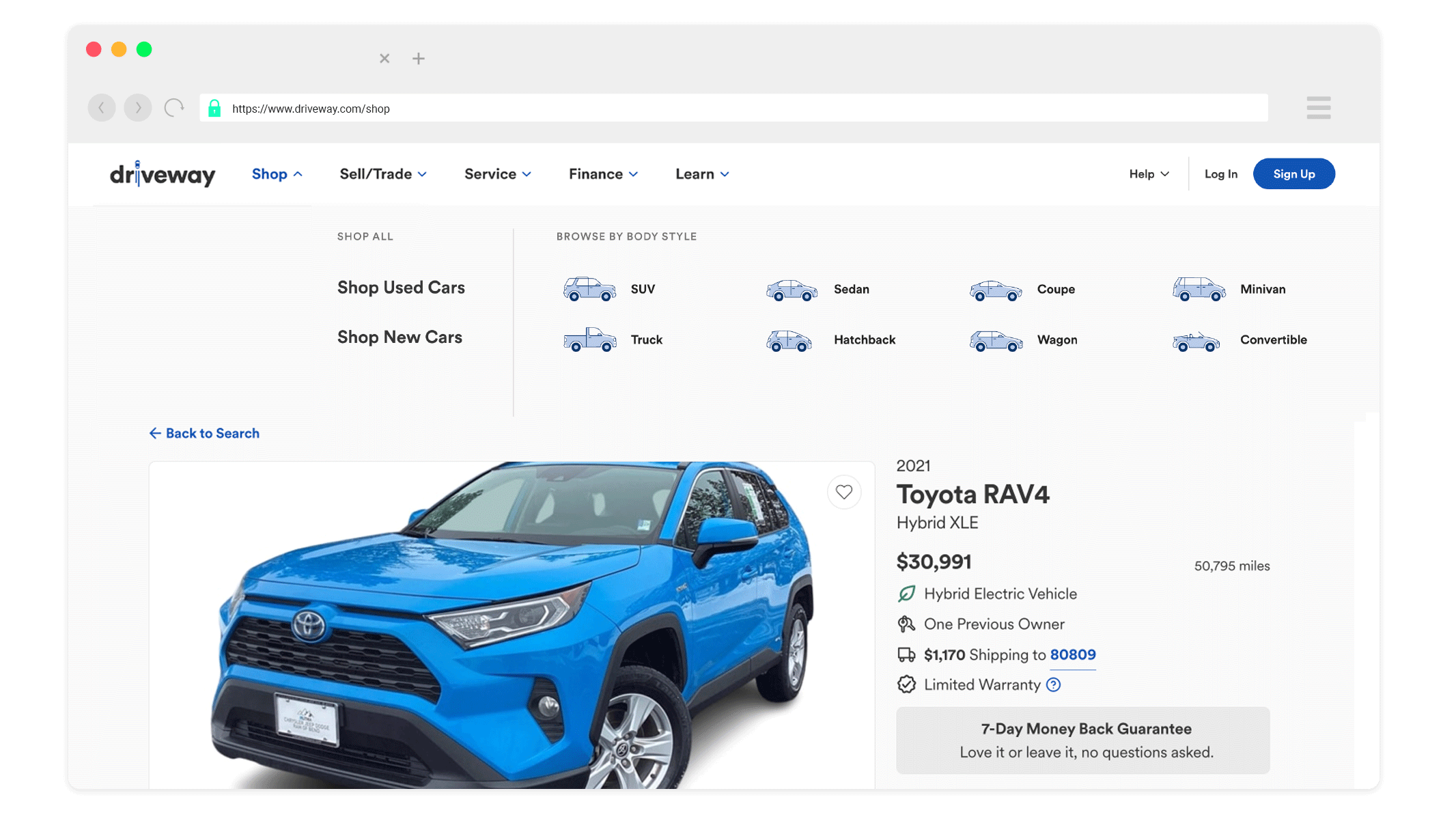
The icons can now be seen both on Driveway’s desktop and mobile sites and mobile app.